
 FAQ
FAQ Help Center
 Form the Blog


New UI for PukkaTeam App
Over time, everything evolves, animals, technology, work and PukkaTeam is no exception to this. Initially the design was built as we went along, placing elements and changes where they would be accessible to users, but in all honesty we didn’t spend enough time on the interface.
We’ve now had the chance to take a step back, and with the help of our designers and your feedback, in 24 hours we’ll be launching a completely overhauled UI, making the app simpler to use and incorporating some new features.
The New UI
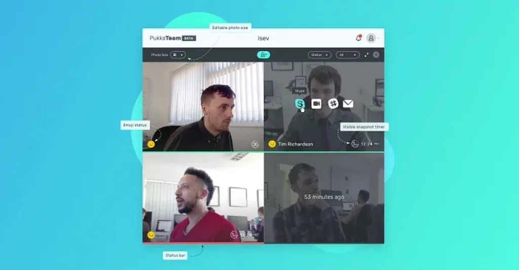
The new app UI hosts some great new features along with an updated user interface. We wanted to try and strip back as much as we could whilst keeping all the important information you need at a glance.
The top bar and filter bar has had a refresh. We felt that having the ability to hide the filter bar would give more space for the team photos, so you can now show/hide the filter bar. Overall the top bar area has been thinned quite a lot to improve vertical space for team photos.
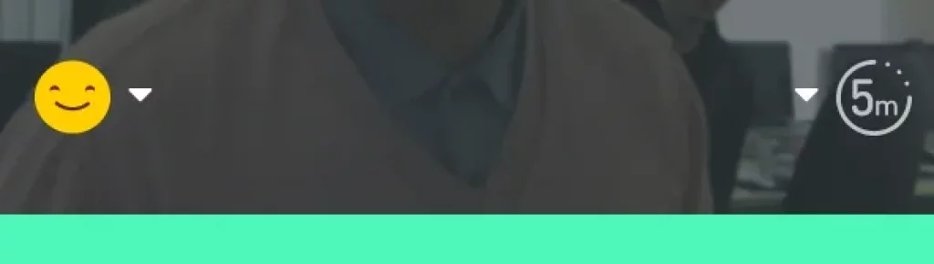
The status icon has been removed and replaced with a cool new emoji that represents each status you’re currently set to. The new status bar sits at the bottom of each team member’s photo.
Please send us your feedback via the on-site chat.
Emoji statuses
Your status is now set via an emoji rather than the traffic light colours, adding a little more personalisation and fun to the app.
😀 is available
😕 is away
😐 is do not disturb
(We’ll be adding more emojis soon).
New status bar
As well as an emoji to represent your current status, we’ve also added a status bar at the bottom of each snapshot, allowing you to see at a quick glance if a teammate is available, away or set to do not disturb.
This is all shown by a simple bar at the bottom of each snapshot, and just like the traffic light system before, green is available, amber away and red for do not disturb.
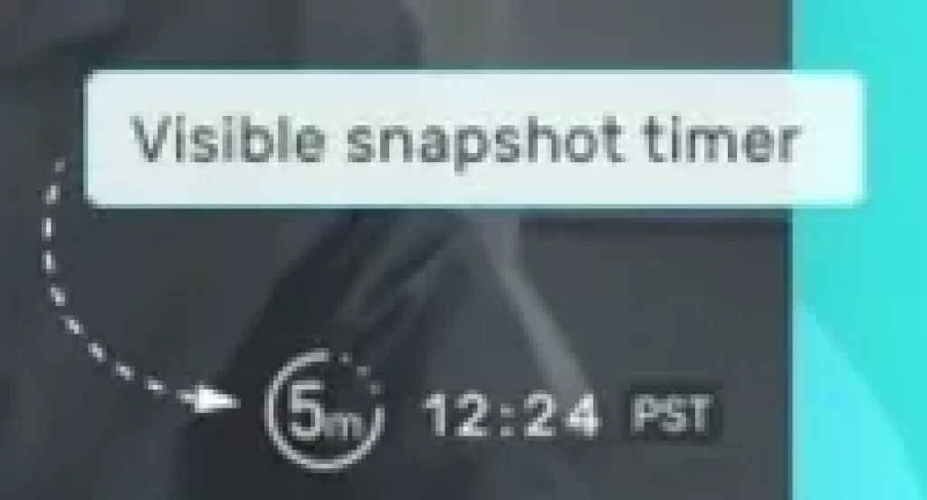
See team mates camera timer
You can also see the time delay people have on their snapshots, no more wondering if the image is the same because they’re either pulling the same face for each snapshot update, or they’ve got it set to manual.
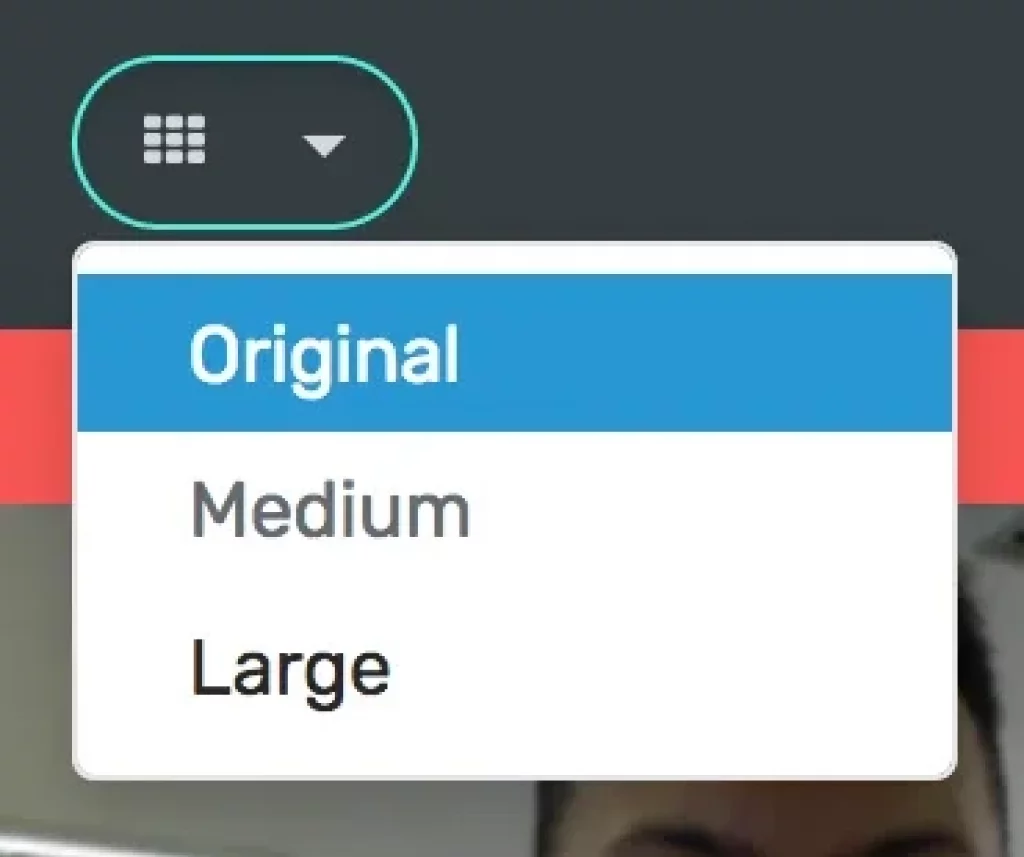
Snapshot size options
There are now three snapshot size options, the original size is 320x240px, we will be adding two larger sizes:
Medium: 400x300px
Large: 480x360px
This will offer more customisability to your set-up, better allowing you to have the app fit to your window and screen size (not to mention being able to see your teams beautiful faces more clearly :P).
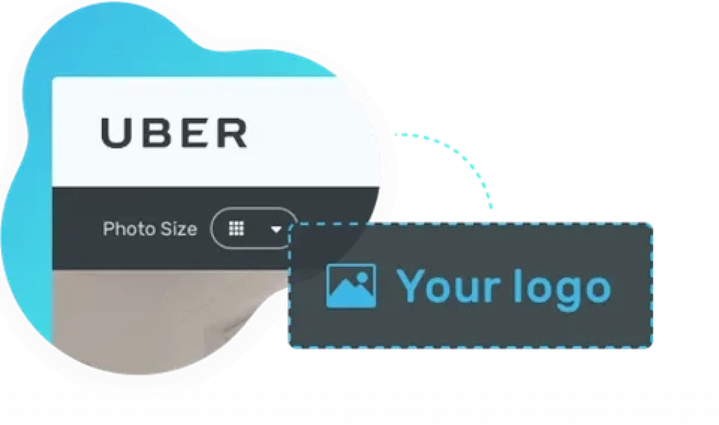
Add your own logo
Make PukkaTeam feel more like home (or your business) by replacing the PukkaTeam logo with your own.
You can set this image team profile settings, the recommended image size is up to 200x84px.
New feature voting system
Share and upvote your suggestions with the PukkaTeam community and help build the app into the tool you need.
Simply click the make a suggestion button on the right hand side of the window where you can make a suggestion and upvote features you’d like to see added.
This will help us decide what features will be prioritised and direct how PukkaTeam will evolve going forward.
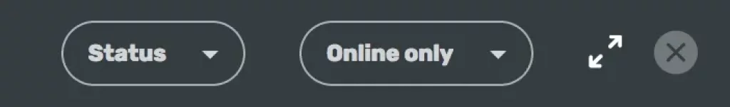
Improved filter bar
All the options and filters are now contained in one bar above your teams snapshots. This can be shown and hidden, making it take up less space on the app and focus more on the team and snapshots.
In here you’ll find:
Snapshot size options
Sort by status and name
Filter to show all of your team or online only
Full screen mode
Invite to team
Would you like to view all these new changes?
The update will be live in the next 24hrs (by 2pm GMT, 20 April).
Want to improve your team communication and collaboration, try PukkaTeam free, and bring your team, together.